You are on lesson 6 of 8 in the course Path 3: Visual Presentation.
Module 3.3: Setting Up Accessible In-Room Caption Displays
Why physical displays still matter
Your agency's website might be fully optimized for accessibility. Your live stream might carry perfectly timed captions. But when a resident walks into your council chamber on a Tuesday evening and sits in the back row, none of that helps them if the in-room caption display is too small to read, mounted in the wrong spot, or running text in a light gray font on a white background.
In-room caption displays are the front line of physical accessibility. They serve people who are deaf or hard of hearing, residents who didn't bring headphones, community members who aren't native English speakers and need extra time to process speech, and anyone seated too far from the dais to hear clearly. Getting the physical setup right is just as important as getting the technology right — and fortunately, both are achievable with the guidance in this article.
This article walks you through what you need for a usable in-room caption display: where to put screens, how big text needs to be for the distances in your space, and how to connect your display to MediaScribe.
The standard you're working toward
WCAG 2.1 Success Criterion 1.4.3 (Contrast) requires a minimum contrast ratio of 4.5:1 between text and its background for normal-sized text, and 3:1 for large text (defined as 18pt or larger, or 14pt bold). For in-room caption displays, this means you can't use light gray text on a white background or dark text on a dark screen — even if it looks fine from the presenter's position.
The ADA also requires that public agencies provide effective communication through auxiliary aids and services. An in-room caption display that exists in the room but can't be read from the back of it doesn't meet that requirement. The display has to work for the people who need it, not just be present in the room.
These two standards together define the target: high enough contrast to be readable in any lighting condition, and large enough text to be read from any seat in the room.
Understanding your room before you configure anything
Before you touch a display setting, spend ten minutes in your meeting room with a measuring tape and a notepad. You need three numbers.
Maximum viewing distance is the distance from the display screen to the seat farthest from it in your audience area. In a small conference room, that might be 12 feet. In a city council chamber with tiered seating, it could be 40 feet or more.
Display screen size is the diagonal measurement of your monitor or TV. A 55-inch display at 15 feet reads very differently than a 32-inch display at the same distance.
Room lighting conditions determine how much ambient light washes out your display. A room with large windows and no blinds requires higher contrast settings than a windowless conference room.
Write these numbers down. You'll use them when selecting your font size and configuring your display colors.
Physical placement guidelines
Where you put your display matters as much as how you configure it. A well-configured display in the wrong location still fails your audience.
Front-of-room placement
The most common setup places one or two displays at the front of the room, flanking the dais or presenter area. This works well for smaller rooms — generally under 30 feet deep — where most audience members have a clear sightline to the front.
Mount displays at eye level for a seated audience. A common mistake is mounting screens too high (as you would for a presentation screen), which forces audience members to crane their necks. Caption displays should sit roughly at the eye level of someone seated in the middle rows — typically 48 to 60 inches from the floor to the center of the screen.
Make sure the display is not backlit by a window or bright light source. High ambient light behind the screen dramatically reduces readability, even with a high-contrast display.
Side-wall placement
For deeper rooms (30 feet or more), consider adding side-wall displays at roughly the midpoint of the audience area. These give people in the back half of the room a closer viewing point without requiring them to look all the way to the front.
When using side-wall displays, angle them 10–15 degrees toward the audience center rather than mounting them flat against the wall. This reduces the viewing angle distortion that makes text look compressed when seen from a sharp side angle.
Multiple-display layouts
Larger chambers often benefit from a multi-display layout: one large display at the front, plus one or two smaller displays mounted mid-room on columns or side walls. This keeps maximum viewing distance under 20 feet for everyone in the room, which significantly reduces the font size requirements.
When running multiple displays, connect them all to the same caption source so text is synchronized across screens. Staggered captions on different screens create confusion and work against the goal.
What to avoid
Avoid placing displays where they compete visually with the speaker area. If your caption display is right next to where elected officials sit, audience members will unconsciously shift their gaze back and forth, which disrupts reading.
Avoid mounting displays above the heads of the presenting panel — the upward viewing angle is awkward for sustained reading. And avoid any placement that requires a neck rotation of more than 45 degrees from a natural seated position.
Font sizing for distance viewing
Here's the practical rule used by broadcast captioners and ADA consultants: for every 10 feet of viewing distance, you need approximately 1 inch of capital letter height on screen.
That translates directly to font sizes on a standard display:
Viewing distance | Minimum capital height | Approx. font size on 55" display | MediaScribe rem value |
|---|---|---|---|
10 feet | 1 inch | 36pt | 2.5 rem |
15 feet | 1.5 inches | 48pt | 3.5 rem |
20 feet | 2 inches | 60pt | 4.5 rem |
30 feet | 3 inches | 72pt | 5.5 rem |
40 feet | 4 inches | 84pt | 6.5 rem |
The rem values are starting points for a 55-inch display. Your actual results will vary based on your screen size, resolution, and browser zoom level. Always verify by running the physical distance test described below.
These are minimums for people with typical vision. For a public meeting where you don't know the visual acuity of every attendee, go one step larger than the minimum. A resident who wears glasses and forgot them that evening still needs to follow the meeting.
A practical test: Set up your display with your planned configuration. Stand at the point of maximum viewing distance in your room and read a few lines of sample text. If you're squinting or leaning forward, increase the font size. Do this before your first public meeting — not during it.
Line length and wrapping
Font size alone doesn't determine readability. Text that wraps awkwardly or runs too wide creates extra cognitive load. A good rule of thumb is to display no more than two lines of caption text on screen at a time, with each line containing no more than 32 characters. Shorter lines, larger text, and high contrast work together to create a display that's easy to read from across a room.
Font choice
For in-room caption displays, use a sans-serif font. Serif fonts (the ones with small decorative strokes at the ends of letters) add visual noise that's harder to parse at distance. MediaScribe's default font, Lexend, is a strong choice — it was specifically designed for readability and reading fluency. Avoid decorative or script fonts, which may look polished but slow reading speed for everyone.
Real-world application: typical government meeting rooms
Most government agencies run public meetings in one of three general settings.
Small conference room (under 20 feet deep, 10–25 seats): A single 40–55 inch display at the front of the room is usually sufficient. Use a minimum of 48pt (3.5 rem) and mount the display at seated eye level. In this setting, you're primarily serving people who are deaf or hard of hearing at close range — large distances aren't the main concern.
Mid-size council chamber (20–40 feet deep, 25–100 seats): Plan for at least one large front display (65 inches or larger) plus one or two mid-room displays if seating extends past 25 feet. Set font size to at least 60pt (4.5 rem) for the front display. Mid-room displays can use a slightly smaller size (3.5 rem) since viewers are closer. Run a physical test with staff seated at various distances before your first public meeting.
Large auditorium or community hall (over 40 feet deep, 100+ seats): This is where multi-display layouts become essential. A single front display will not serve the full audience. Work with your facilities team to identify column or wall mounting points at 20-foot intervals. Use 5.5 rem or larger on the front display and 4.5 rem on mid-room displays. In large venues, also consider promoting your QR code for mobile captions as a supplementary option for attendees who prefer to follow along on their phones.
MediaScribe integration: in-room display configuration
MediaScribe Integration
Once you've determined your placement and font size requirements, you can apply those decisions directly in MediaScribe. Setting up an in-room display involves two steps: configuring the display appearance in TV Branding (Settings → TV Branding → Edit TV Config), then assigning it as an output in your preset (Settings → Edit Preset → Outputs).
In the Outputs tab, set one output slot to "In Room Display," select your TV Branding configuration, and choose your display language. From that point forward, the in-room display activates automatically whenever that preset is running — no extra steps before each meeting.
The Transcript tab in Edit TV Config is where you set font, size, line height, alignment, and padding. The default font size of 4.5 rem and line height of 1.7 are good starting points for a mid-size chamber. Use the live preview panel to check your layout before saving, then confirm with a physical distance test in the actual room.
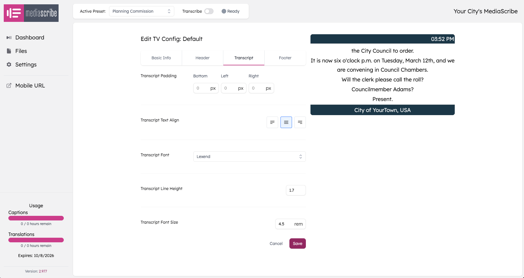
The Transcript tab in Edit TV Config showing default settings. The live preview on the right reflects your agency's branding and updates in real time as you adjust values.
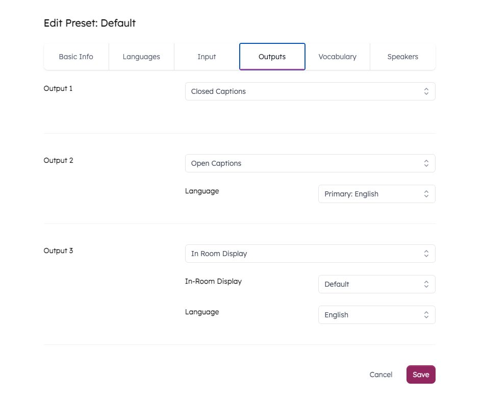
The Outputs tab in Edit Preset is where you assign your TV Config to an output slot. Multiple outputs can run simultaneously — here, closed captions, Spanish open captions, and an in-room display are all active for the same meeting.
A note on rem values: The font sizing table earlier in this article includes approximate rem values as a starting point. Because rem rendering depends on your screen size, resolution, and browser zoom level, treat those values as a baseline rather than a precise target. Use the live preview in Edit TV Config and the physical distance test to confirm the result looks right on your actual display.
In the next article, we'll walk through mobile captioning via QR code — including how to position codes in your room so attendees find them quickly.
Summary
Getting in-room caption displays right comes down to three things working together: the right physical placement so everyone has a clear sightline, the right font size for the distances in your specific space, and a high-contrast display configuration that holds up under real-world lighting.
Key takeaways:
Mount displays at seated eye level (48–60 inches to screen center), not at presentation height
Use the 1-inch-per-10-feet rule to calculate your minimum font size, then apply the corresponding rem value in MediaScribe
Larger rooms need multiple displays to keep maximum viewing distance manageable
White or light-yellow text on a solid black background supports the 4.5:1 contrast requirement across most lighting conditions
Test readability from the farthest seat in the room before your first public meeting
In MediaScribe, save display configurations per preset so each room gets the right settings automatically