You are on lesson 1 of 8 in the course Path 3: Visual Presentation.
Module 3.1: Understanding the 4.5:1 Contrast Ratio Requirement
When you're setting up captions for city council meetings or emergency broadcasts, the colors you choose matter more than you might think. WCAG Success Criterion 1.4.3 requires text to have a contrast ratio of at least 4.5:1 against its background. This applies to your captions, video player controls, and any text overlays you use in government video.
The requirement protects everyone in your community—not just people with visual disabilities. Proper contrast helps residents watching on small phone screens, older adults with age-related vision changes, and anyone trying to view your meeting stream in a bright office or outside in sunlight.
What contrast ratio actually means
Contrast ratio measures the difference in brightness between two colors. The math compares the relative luminance (how light reflects off each color) to produce a number between 1:1 (no contrast at all) and 21:1 (maximum contrast).
The formula looks like this: (L1 + 0.05) / (L2 + 0.05), where L1 is the lighter color and L2 is the darker color.
You don't need to calculate this yourself. Free tools do the math for you—we'll cover those in a moment.
Why 4.5:1?
Researchers working on the WCAG standards tested various contrast levels with people who have moderately low vision (20/40 visual acuity). They found that 4.5:1 provides sufficient clarity without requiring assistive technology like screen magnification.
Think of it like curb cuts. Curb cuts were designed for wheelchair users but help everyone—parents with strollers, delivery workers with hand trucks, travelers with rolling luggage. Similarly, 4.5:1 contrast helps people with low vision and also makes your content more readable for everyone.
What the requirement covers
WCAG 1.4.3 applies to the visual presentation of text and images of text in your video content. Here's what needs to meet 4.5:1:
Caption text and its background (whether semi-transparent black boxes or solid overlays)
Video player buttons and controls (play, pause, volume, fullscreen)
Any text burned into your video (lower-third name tags, emergency alerts, meeting titles)
Links and interactive elements in your video platform
What's exempt
A few specific situations don't require 4.5:1:
Large text: If your text is at least 18 point (24px regular weight) or 14 point (18.7px bold weight), you only need 3:1 contrast. Most caption text is smaller than this, so the 4.5:1 requirement applies.
Logotypes: Your city seal or government logo has no contrast requirement. These are considered essential presentation.
Incidental text: Text that's purely decorative, invisible, or part of an inactive button doesn't need 4.5:1. For example, if your "record" button is grayed out because you're not recording, that inactive state is exempt.
Text in images: If there's text visible in photos or video of your meeting (like text on a presenter's slides or a document shown on screen), that doesn't count. The requirement covers text you control—captions, UI elements, and overlays.
Visual examples: what passes and what fails
Understanding contrast ratios is easier with actual examples. Let's look at common caption color combinations you might use for government meetings.

Example 1: White text on black background
Foreground: White (#FFFFFF)
Background: Black (#000000)
Contrast ratio: 21:1
Result: PASS (far exceeds 4.5:1)
This is the highest possible contrast. It's what MediaScribe uses as the default for caption display, and it works well for most meeting scenarios.
Example 2: White text on dark gray background
Foreground: White (#FFFFFF)
Background: Dark Gray (#595959)
Contrast ratio: 7.5:1
Result: PASS (exceeds 4.5:1)
Many government agencies prefer softer backgrounds than pure black. This dark gray provides excellent contrast while being slightly less stark.
Example 3: Light gray text on white background
Foreground: Light Gray (#757575)
Background: White (#FFFFFF)
Contrast ratio: 4.54:1
Result: PASS (just meets 4.5:1)
This barely passes. While technically compliant, it's risky—small changes to the gray could push it below 4.5:1. Use darker text for more headroom.
Example 4: Medium gray text on white background
Foreground: Medium Gray (#959595)
Background: White (#FFFFFF)
Contrast ratio: 2.85:1
Result: FAIL (below 4.5:1)
This is a common mistake. The gray looks dark enough at first glance, but it fails the requirement. Residents with low vision would struggle to read these captions.
Example 5: Your city's brand blue on white
Foreground: City Blue (#4A90E2)
Background: White (#FFFFFF)
Contrast ratio: 3.4:1
Result: FAIL (below 4.5:1)
Many government brand colors don't meet contrast requirements. You'll need to darken the blue to about #1E5C96 to achieve 4.5:1 on white backgrounds.
Example 6: Yellow text on transparent black box
Foreground: Yellow (#FFFF00)
Background: Black Semi-Transparent (85% opacity, #000000)
Contrast ratio: 19.56:1
Result: PASS (far exceeds 4.5:1)
Yellow on black provides excellent contrast for emergency announcements or weather alerts. The high visibility makes this a good choice when you need captions to stand out.
Testing your caption colors with MediaScribe's contrast checker
MediaScribe provides a free contrast checker tool specifically designed for caption testing. You can access it here.
This tool helps you verify caption colors before going live with your meetings. Here's what it offers:
Real-time contrast calculation
Enter your foreground (text) color and background color using the color pickers or hex codes. The tool instantly calculates the contrast ratio and shows you whether it passes WCAG AA (4.5:1) and AAA (7:1) standards.
Live caption preview
See how your chosen colors will actually look as captions. The preview displays sample text at the size your viewers will see, helping you evaluate real-world readability before you commit to a color scheme.
Additional testing tools
Beyond MediaScribe's checker, these free tools can help verify contrast ratios:
WebAIM Contrast Checker
Go to webaim.org/resources/contrastchecker and enter your foreground and background colors. The tool instantly calculates the ratio and tells you if it passes WCAG AA (4.5:1) and AAA (7:1).
You can enter colors as hex codes (#FFFFFF), RGB values, or use the color picker to select from your screen.
Chrome DevTools
If you use Chrome to review your meeting streams:
Right-click any text element and select "Inspect"
Find the color property in the Styles pane
Click the small color square next to the hex value
The color picker shows the contrast ratio at the bottom
Chrome tells you if it passes AA and AAA standards
This is particularly useful for checking your video player controls, since you can test them directly in your browser.
Adobe Color
At helpx.adobe.com/creative-cloud/adobe-color-accessibility-tools.html, you can check individual color combinations or upload your entire color palette to test everything at once.
This works well if you're establishing brand guidelines that need to include accessible color options.
Practical application for government video
Let's look at how to apply these requirements to your actual meetings and broadcasts.
Setting up MediaScribe captions
MediaScribe's captions use white text on black backgrounds (21:1 contrast) because it's universally accessible. This color combination cannot be changed, which ensures consistent compliance across all meetings.
When you configure Mobile Branding in MediaScribe's settings, you can customize the header and footer appearance for viewers using the QR code on their phones. This lets you add your agency branding while the caption text itself maintains optimal contrast.
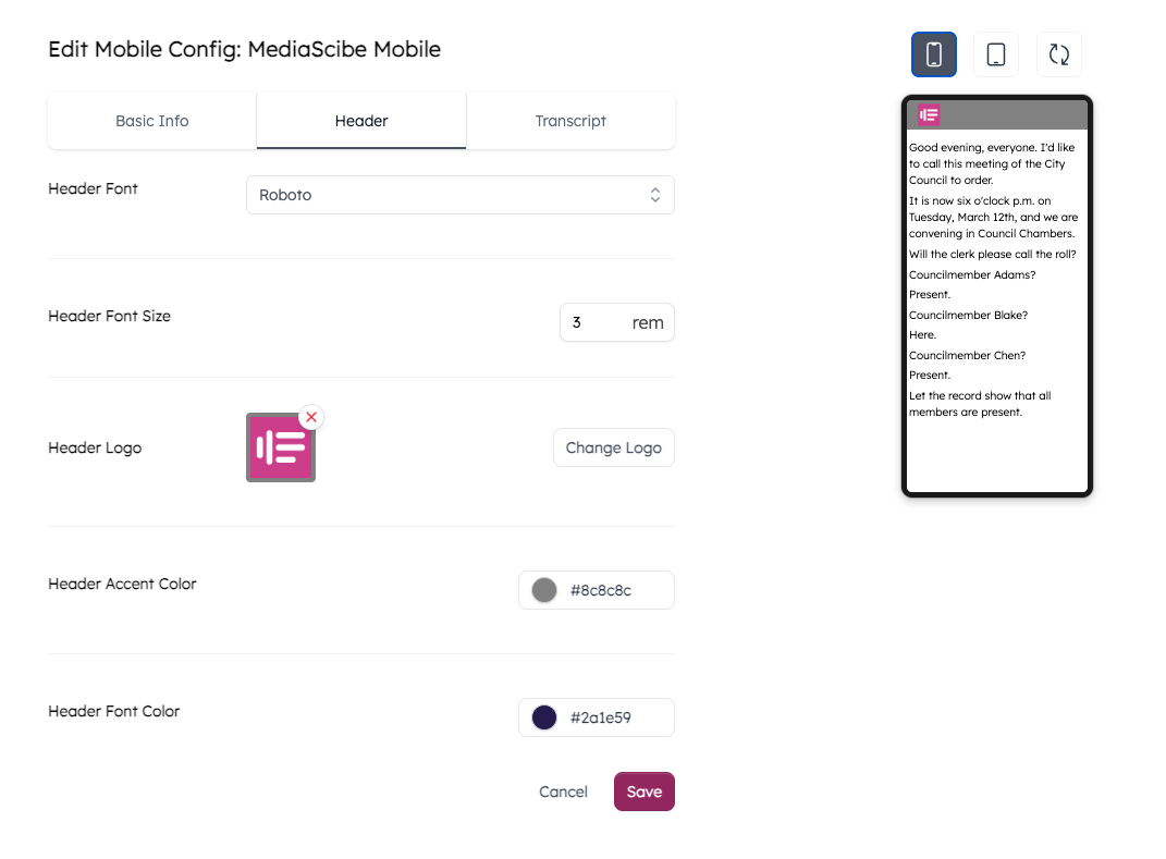
For header and footer customization:
Use MediaScribe's contrast checker first to verify your brand colors pass 4.5:1
Test the branded interface on actual devices—phones and tablets
Ask colleagues with varying vision capabilities to review readability
Remember that caption text remains white on black regardless of header/footer colors
In-room caption displays
For residents watching captions on displays in your council chambers or public meeting rooms:
Larger screens from a distance act like smaller screens up close
Font size matters more on displays than on personal devices
High ambient lighting in meeting rooms reduces perceived contrast
Test your colors with overhead lights on during the day
If your chamber has bright fluorescent lighting, you might need higher contrast (7:1 or more) for comfortable viewing, even though 4.5:1 is the minimum requirement.
Emergency broadcasts
Emergency alerts and severe weather announcements need maximum visibility. For these, use the highest contrast combinations:
White on black (21:1)
Black on yellow (19.56:1)
White on dark blue (#003366 gives 11.8:1)
Don't rely on color alone to convey urgency. Use text that explicitly states "EMERGENCY" or "SEVERE WEATHER ALERT."
Video player controls
Your streaming platform's player buttons must also meet 4.5:1. This includes:
Play/pause buttons
Volume controls
Fullscreen toggle
Caption on/off button
Progress bar and time stamps
Check with your streaming provider or web development team to verify these controls are compliant. If you manage your own video player, test every interactive element.
Beyond minimum compliance
Meeting the 4.5:1 requirement is essential, but it's the floor, not the ceiling. Consider these approaches to exceed the minimum:
Aim for WCAG AAA (7:1)
While WCAG AA (4.5:1) is the legal requirement for government websites and video, WCAG AAA (7:1) provides even better readability. If your color choices can achieve 7:1 without compromising other design needs, consider that higher standard.
For example, white on black (21:1) far exceeds AAA. It costs you nothing to use it, and it helps more people.
Provide caption customization
MediaScribe's mobile captions let viewers adjust appearance on their own devices. Some residents might prefer:
Higher contrast than your default
Different color combinations based on personal preference
Larger text sizes
Different fonts
Giving viewers control ensures everyone can read captions comfortably, regardless of your default settings.
Test with actual users
Contrast ratios are a mathematical measurement, but human perception varies. Invite residents with different vision capabilities to test your captions:
Older adults with age-related vision changes
People with low vision who don't use assistive technology
Residents with color vision deficiencies
Anyone who regularly watches your meetings
Their feedback will tell you if your accessible color choices actually work in practice.
Common questions
Q: Do I need 4.5:1 for captions on video when the video already has good contrast?
Yes. The contrast requirement applies to the captions themselves against their immediate background (the caption box or the video frame), not to the overall video content. Even if you're streaming a well-lit meeting with good contrast, your white caption text still needs 4.5:1 against its background.
Q: What if our city brand colors don't meet 4.5:1?
You have several options. You can darken or lighten the brand color until it meets 4.5:1. You can use brand colors for non-text elements (like your logo or decorative borders) while using compliant colors for text. Or you can request an update to your brand guidelines that includes accessible color alternatives.
Many government agencies maintain two versions of their color palette: primary brand colors for logos and headers, and accessible alternatives for text and UI elements.
Q: Can I use a semi-transparent background for captions?
Yes, but you need to calculate contrast against the actual background that shows through. If your semi-transparent black box is 80% opaque over video, test it against a representative video frame to ensure the combination still achieves 4.5:1. Solid backgrounds are safer because the contrast ratio remains constant.
Q: Do these requirements apply to live captions, or just pre-recorded content?
Both. WCAG 1.4.3 applies to all visual presentation of text. Your live city council captions need the same contrast ratio as captions on archived meeting recordings. MediaScribe handles this automatically—the colors you configure apply to both live and recorded content.
Q: What about captions in different languages?
The contrast requirement applies equally to all languages. Whether you're displaying English captions, Spanish translations, or any of MediaScribe's 72+ supported languages, the text must meet 4.5:1 against its background. Character sets and languages don't change the visual accessibility requirements.
Quick reference
Minimum contrast ratios:
Normal text (smaller than 18pt): 4.5:1
Large text (18pt+ or 14pt+ bold): 3:1
Non-text elements (icons, buttons): 3:1
Safe color combinations:
White on black: 21:1
Black on white: 21:1
White on dark gray (#595959): 7.5:1
Black on light gray (#C0C0C0): 8.6:1
Yellow on black: 19.56:1
Testing tools:
MediaScribe Contrast Checker: mediascribe.ai/resources/contrast-checker
WebAIM Contrast Checker: webaim.org/resources/contrastchecker
Chrome DevTools: Built into browser (right-click > Inspect)
Adobe Color: helpx.adobe.com/creative-cloud/adobe-color-accessibility-tools.html
Where it applies in government video:
Caption text and backgrounds
Video player controls
Text overlays and lower-thirds
Interactive elements
Emergency alerts
What's exempt:
Logotypes (government seals, logos)
Inactive UI elements
Purely decorative text
Text in photographs or video frames
Resources for deeper learning
The W3C provides detailed technical understanding of WCAG 1.4.3 at w3.org/WAI/WCAG21/Understanding/contrast-minimum.html. This includes the complete technical specifications, testing procedures, and examples.
For government-specific guidance on web accessibility requirements, including contrast ratios, see the Department of Justice's guidance at ada.gov/resources/2024-03-08-web-rule. This connects contrast requirements to ADA Title II compliance for state and local governments.
The April 2027 compliance deadline for WCAG 2.1 Level AA applies to government websites and mobile apps, which includes embedded video players and their controls. Making your video content compliant now protects your agency and serves your community better.