You are on lesson 2 of 8 in the course Path 3: Visual Presentation.
Module 3.1: Testing Your Caption Colors: Tools and Techniques
Your caption display is set up. The text looks readable on your screen. But will it hold up for a community member watching on a TV across a council chamber — or checking captions on their phone in a bright parking lot? "Looks fine to me" is not a compliance standard.
This article shows you how to use free tools to verify that your caption display colors meet WCAG 2.1 requirements, and where to check the color values in your display configurations.
You don't need a design background to do this. The testing process takes about five minutes, and the tools do the math for you.
The standard you're testing against
WCAG 2.1 Success Criterion 1.4.3 (Contrast Minimum, Level AA) requires a contrast ratio of at least 4.5:1 between text and its background for normal-sized text. For large text — roughly 18pt or larger, or 14pt bold — the requirement drops to 3:1.
A contrast ratio is a mathematical comparison of how light or dark two colors are relative to each other. Pure black on pure white is 21:1, the maximum. Light gray on white might be 1.5:1 — essentially invisible to many readers. The 4.5:1 threshold reflects the contrast level that people with moderately low vision need to read text without additional assistive technology.
WCAG 2.1 Success Criterion 1.4.11 (Non-text Contrast, Level AA) extends this thinking to user interface elements — things like buttons, icons, and borders. Any visual element that conveys meaning (not just decoration) needs at least 3:1 contrast against adjacent colors. For caption display headers and footers, this means branded bars and dividers also need to meet the threshold, not just the text inside them.
For your caption displays, you're testing elements that community members depend on to follow public meetings. That puts contrast directly in service of the people your agency serves.
Tool 1: WebAIM contrast checker
URL: webaim.org/resources/contrastchecker
The WebAIM Contrast Checker is free, browser-based, and takes about 30 seconds to use. Enter two hex color codes — your text color and your background color — and it immediately shows you the contrast ratio and whether it passes or fails WCAG AA.
A hex color code is a six-character code that identifies a specific color. You've likely seen them before: #FFFFFF is white, #000000 is black. Display configuration tools typically show these values next to each color field.
How to use it:
Identify the hex values for your text color and background color.
Enter the text color in the Foreground Color field.
Enter the background color in the Background Color field.
Check that the result shows "Pass" next to "WCAG AA Normal Text."
Reference: what different ratios look like
Color pair | Ratio | Result |
|---|---|---|
Black ( | 21:1 | Passes |
White ( | 7.7:1 | Passes |
Dark blue ( | 3.8:1 | Fails |
Yellow ( | 1.1:1 | Fails |
The tool also shows results for large text and WCAG AAA thresholds, but WCAG AA Normal Text is the standard your agency needs to meet. One thing to watch: light or bright colors — yellow, sky blue, light green — almost always fail against white backgrounds, even when they feel visually "strong." Run them through WebAIM before assuming they'll work.
Tool 2: Adobe Color accessibility tools
URL: color.adobe.com/create/color-contrast-analyzer
Adobe Color goes a step further than basic contrast checking. Its accessibility tools let you test color pairs and simulate how they appear to viewers with different types of color vision differences — including deuteranopia and protanopia, both forms of red-green color vision difference that affect roughly 8% of men and 0.5% of women.
This matters when your organization wants to apply brand colors to display headers or footers. A combination that looks distinct to most viewers may be difficult to read for a portion of your audience.
Where Adobe Color is most useful:
Evaluating whether your city or county's brand colors can be used safely in display headers
Checking a proposed new color scheme before you configure it
Seeing how your choices appear to viewers with color vision differences
Adobe Color requires a free account to save color palettes, but the contrast analyzer works without logging in.
Tool 3: Browser developer tools
If you want to verify the exact colors rendering on a live display page, browser developer tools can help. In Chrome or Firefox, right-click any element and select "Inspect." In the Styles panel, look for the color and background-color properties. Copy those hex values into WebAIM to confirm the rendered result matches your configuration. Most teams won't need this step regularly, but it's useful after making changes to a live display.
What this looks like for a city clerk
Your city recently refreshed its visual identity. The communications team wants to see the new palette — a medium blue and a light silver — reflected in the header of your council meeting caption displays.
Before making any changes, you run the proposed pair through WebAIM. Medium blue (#4A7FC1) on light silver (#D8D8D8) returns 2.9:1. That fails WCAG AA.
You try a darker background and retest. White (#FFFFFF) on dark navy (#1A3A5C) returns 10.1:1. That passes — and the display still looks polished and on-brand.
The whole process takes about two minutes. You record the tested hex values in your configuration notes, so your agency has a clear paper trail when a compliance review comes around.
MediaScribe integration
Once you've verified your color choices using WebAIM or Adobe Color, you're ready to apply them in MediaScribe. Contrast testing and display configuration work together: test first, then configure with confidence.
Where color settings live
Caption text itself — the transcript your audience reads — displays in black on white by default. This gives you a 21:1 contrast ratio with no configuration needed.
The color controls you need to review are in the Header and Footer sections of your TV and Mobile display configurations. Navigate to Settings, open your TV or Mobile config, and select the Header or Footer tab.
Each section includes two fields:
Header/Footer Accent Color — the background color of the display bar
Header/Footer Font Color — the text color for that bar
Both accept hex values. The live preview on the right updates as you type, so you can see the result before saving.
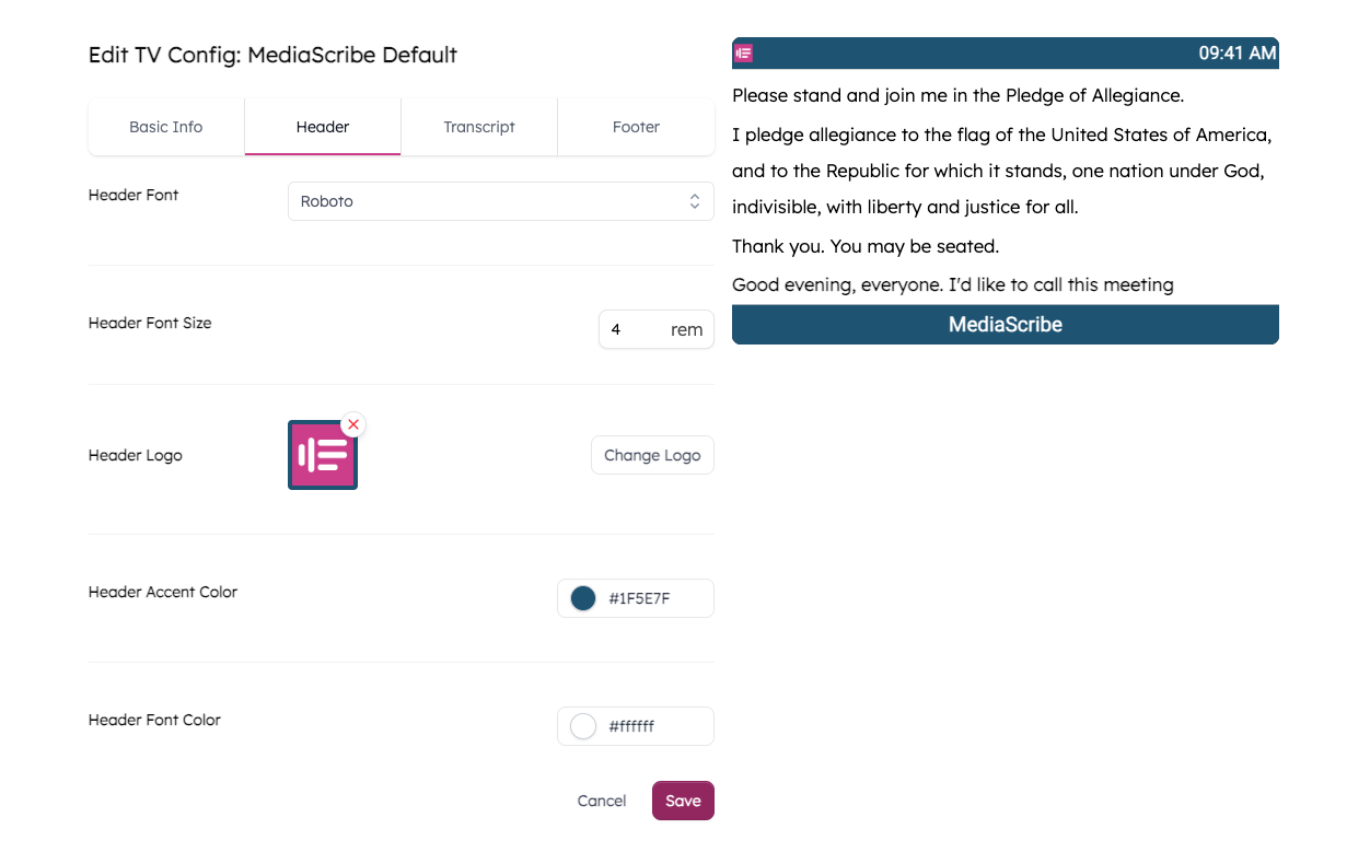
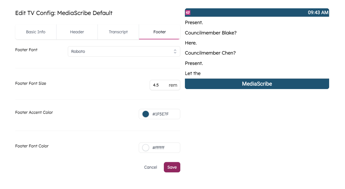
MediaScribe's default color scheme — white text on a dark teal background (#1F5E7F) — returns a contrast ratio of 7.7:1, which supports WCAG 2.1 SC 1.4.3. If your displays are still using the defaults, you're in a good starting position. The risk comes when you replace them with brand colors that haven't been tested.
Note that TV and Mobile display configs are independent — updating colors in one doesn't carry over to the other. Check both when making changes.
A practical checklist
Use this when setting up a new display configuration, reviewing an existing one, or preparing for a compliance review.
When configuring display colors:
Identify your proposed text color and background color hex values.
Enter the pair into WebAIM Contrast Checker and confirm "Pass" for WCAG AA Normal Text.
If the pair fails, you have two options: darken the background color or switch to a higher-contrast font color. Either can work — test both and choose whichever reaches 4.5:1 while fitting your brand.
If applying brand colors, also run the pair through Adobe Color to check color vision accessibility.
Record the tested values and contrast ratios in your configuration notes.
Apply the verified hex values in your display configuration and save.
When preparing for a compliance review:
Screenshot your WebAIM results showing the color values and passing ratio.
Screenshot the Header and Footer tabs in your display configurations showing the applied values.
File both with your compliance documentation and note the date tested.
Summary
WCAG 2.1 SC 1.4.3 requires at least 4.5:1 contrast between normal-sized text and its background. Large text (18pt+ or 14pt bold) requires 3:1.
A contrast ratio compares how light or dark two colors are. Higher numbers mean more contrast and better readability for a wider range of viewers.
WebAIM Contrast Checker is free and fast — enter two hex values and get a pass/fail result in under a minute.
Adobe Color tests contrast and simulates how color pairs appear to viewers with color vision differences — useful when applying brand colors.
In MediaScribe, caption transcript text is fixed at black on white (21:1). Color controls are in the Header and Footer tabs of TV and Mobile display configs.
MediaScribe's default colors support WCAG 2.1 AA out of the box (white on
#1F5E7F, 7.7:1). Always test before replacing defaults with brand colors.Document your tested color pairs and contrast ratios. This record supports your agency's compliance efforts if questions arise later.
This article supports WCAG 2.1 Success Criteria 1.4.3 (Contrast Minimum, Level AA) and 1.4.11 (Non-text Contrast, Level AA). Module 3.1: Color contrast and readability | MediaScribe Academy