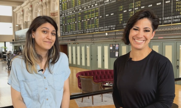
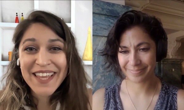
We realized that we were gonna have to make some compromises around our brand's color choices. From like a branding perspective, a marketing perspective, somebody that works on graphic design, your main job is to make things look nice. Everything look pretty. So I guess that initial thought of to be able to be compliant , does it mean that we lose that aesthetic in the process? And actually that's not the case. There are ways to work around that, and that's the thing about that journey to be accessible. There are tools online that you can use that make your job a whole lot easier. go onto a website, you input the color hex code, and it tells you immediately if it fails, if it passes, if it's, you know, WCAG double A compliant or triple A compliant, you can work around it and you can expand that creativity and find ways to be compliant, but still have great graphics and still have great colors, and a consistent color palette with your brand that still works for people with disabilities. Hello everyone and welcome back to the Government Video Podcast where we explore how local governments and community media centers use video and streaming to better serve their residents. I'm Michelle Alimoradi, and I'm your host this week. Today we're taking a bit of a detour from our usual topics and our typical guest roster because we've got a special behind the scenes episode for you. Now, I don't usually bring my own team on the podcast to talk about their work, but today we're making an exception because recently we overhauled our company's digital branding and styles to be more accessible. And as we've been hearing more and more questions from local government teams asking about how to actually apply these web content accessibility guidelines or WCAG that will be required of them in the next year or so, we decided to address that 'cause in conversations we're having, folks are looking for a more tangible understanding of what these accessibility overhauls can look like. So we figured this was the perfect time to share our process and break it down for you. you might be asking. Why are we covering this topic, which largely affects graphics and web design choices on a podcast about video? Well, because your branding, your colors, your fonts, your language choices all live where your video lives on your website and on your streaming apps and on your VOD portals. So yes, while some cities are still distributing on cable, where you have very limited control of the viewer experience beyond adding captions or translations, let's say, um, even if you're still cable casting, many of you are seeing the majority of your viewership shift to web and streaming apps where you do get a lot of branded wrapper around your video content. So that means your digital branding is now a part of the viewer experience for your video content, and that means, you probably guessed it, it needs to be accessible. So in this episode, I'm chatting with my colleagues from Tightrope Media Systems, Maria Calvo and JJ Parker, and they are the Creative Marketing Manager and CEO slash Web Manager, respectively. We are going to talk through what the process looked like for us, overhauling our branding for accessibility, how we rolled out those changes to our team, and the things we didn't expect, as well as some of the things that we still have left to tackle. So Maria, JJ, thanks for coming on today. We're excited to have you. Thanks, Michelle. us. Team meeting. Let's get into it, and I'm gonna start with you JJ. We're gonna give folks a little background to begin with. You are the Co-Founder of Tightrope, I am some people might not know, has been around since 1997. Um, a very long time. time. Very long time. And over that period of time, you have worn many hats and one of those for a long time has been graphic designer. Not officially, but just because it was a two person team and you had a lot of things to do. So I'd love to start by touching on the evolution of the way that you've handled this work, because there's been so many branding overhauls, and probably a different process every time. So for folks that are concerned about having a really small team, not having dedicated tasks or dedicated people on staff to handle these tasks, I just feel like it's helpful to let them know that it's it's possible. And talk about how you did it. My main background before I started Tightrope, I was actually going to art school. So I was training to be a graphic designer. And I really do have like a passion around visual communication and video and design as a communication method. So to me, branding's super important. And, when we first started Tightrope, you know, again, like you said, we're a small scrappy team. So we kind of did what we could with our own talents. But one of the very first hires we made once we could hire another teammate was a proper graphic designer. And to me it was always been really important that the company has a consistent brand. Things look good. Like you said, it is been an evolution. In the early days, it was pretty scrappy looking. But we've always tried to maintain consistency in our branding 'cause I think that's really important, whether you are like a big, huge company, a little company, a government, a nonprofit. Like all of these organizations need to have a consistent look that their viewers, customers, residents, whatever it might be can identify with. This idea of creating consistent branding I think is super important. And. To follow up on that, because we tackled a lot more than just looks in this last overhaul. Why did you feel that it was important to do this even though we're not required to follow these accessibility guidelines? Good question. Mostly 'cause it's the right thing to do. Um, that. The early web stuff, you know, even 10 years ago, even maybe in five years ago a lot of the accessibility stuff really wasn't in the front of people's minds, right? It wasn't really a thing. Like you could make a website 10, 15 years ago and it could be completely inaccessible, by a huge chunk of the population and no one seemed to care. But then as we started looking at who are we trying to serve and are we creating equal access to these resources for all of our constituents. We started focusing on accessibility and just to kind of define what that means for a website a little bit more, that means that the colors and contrast and layout has to be done in a certain way. So people who are visually impaired can see it and read it. It needs to be like screen reader accessible. So if you can't see it all, you can have it read to you. It needs to be navigatable if you can't see. Right. The videos need to have captions on them if you can't hear. Right? So there's all these different modalities of accessibility. And the one thing, there's actually, Microsoft did this really awesome study and reports about accessibility. And one of the things that really struck me from that was they talked about, accessibility isn't like a binary thing for people. It's not like you are impaired or not impaired, right? It's actually a continuum because there might be a lot of times where you need to use accessibility features, but only temporarily, right? If you can walk, you can walk. But if you have an amputated leg, then you have an amputated leg, right? But there's actually another state where you broke your leg. So that's only temporary, right? So you just can't walk. You can walk, but you just can't walk right now. So there's all sorts of things like that that we need to remember about the people who are using our websites is that it's not one or the other. There's variance and there's temporariness to a lot of these conditions that we need to account for people. Yeah. And you know, it's funny that you mention the temporary thing because in my personal experience, there was a period of time where I was experiencing repeated corneal abrasions in my eyes. And for a couple of days, each time that would happen, I could not look at screens at all. I could hardly look at light at all. And I was struggling at that moment to try to navigate like the accessibility features. Um, just, but it's like I, the vision was already impaired, so I didn't know how to do it. And it was really difficult at that time. And then because it was temporary just a few days, I didn't learn it, but you very quickly realize like, oh, there's certain things that I just completely cannot do right now because I cannot see. And a lot of those were right. There were a lot of really important things that I then had to be totally reliant on someone else to help me with. And I've also heard other stats where, you know, you think that you're putting these things in place just for people that have these more specific like permanent needs. But a lot of times, more than half of the people out there will use accessibility features, even if they aren't required for them. That's the other part of accessibility that I think is actually really important, is what's called the curb cut effect. And so back when they were first making roads, when cars came out, when cars were new tech, they make roads and they put curbs on the road. And you'd have to step on and off the curb, right? But it wasn't until some of the accessibility laws came into play where they said, Hey, actually on the corners we need to put a little ramp down to the street so there's no curb there. So wheelchairs can roll down that. 'cause you can't, like, roll a wheelchair down or up the big eight inch curb. But that little ramp serves everybody, not just people in wheelchairs. It's really convenient for everyone. Who is crossing the street. Right. And a lot of these accessibility features that we're putting into to websites now are for sure in that category for me, as like that curb cut effect is I'm sure we've all seen it. Like I do it, I'll oftentimes watch a video with the closed captions on because I don't want to disturb my partner. I don't wanna wake up the kids. Or it's something that maybe has an accent to it and I really wanna follow along, but I not having trouble recognizing what they're saying. So features like that can really help everybody in our community. Yeah. And I think it's so great to point that out because the other thing that I'm hearing from cities, like, yes, there's concerns about cost and, and timelines that are scary, but the majority of people that we're talking to are actually, you know, very interested in being as accessible as possible, as, as a value. And I think that's something that we've adopted here at Tightrope too. And that's what got us going on this journey. So let's talk about the journey. It's like, talk about the journey. Let's, let's but Oh boy. The journey. Um, so JJ and Maria, you both really did a lot of the heavy lifting on this overhaul. Maria, where, where did this start for you? Like what did you see as, as the problem that you needed to solve? Well, I feel like initially we were having conversations about focusing on speaking to the crowd on making content accessible everywhere, but I feel like there's been a shift now, to make accessible, content accessible for everyone. So we've been offering these tools and these solutions, right? And it really came down to having that conversation of, hmm, I think we really need to be practicing what we preach. So, it was basically that, that conversation of maybe we need to do like an audit on making sure that the content that we're putting out, whether it be emails, whether it be images, video, all that. Our website isn't really accessible. Like, are we doing the right things? Do our colors have enough contrast? Like are we meeting the standards? We're offering those tools for organizations to be compliant. So we wanna make sure that we are compliant as well. I'll credit Michelle. One of the things you did, Michelle, was you said, before we dove into this, 'cause I was like, you know, you know me, I'm like a little gung-ho on things. I'm like, we're working on accessibility, let's go. And you're like, hold on, let's actually get a baseline of what is actually compliant and what is not. Right. So you helped make us a list of things that we needed to do on our website, before we just hopped in and started doing stuff. I mean, I feel like maybe you started hopping in and doing stuff before I made and then you slide, and then you put on the brakes. Yep. I think that's a step that I felt was important, but also something that I've been hearing from the people that have been informing me as I look into this work, that folks are saying like, Hey, you don't have to do this all at once. Right? And no one expects you to do it all at once. They expect you to make a best effort. And, you know, getting back to, no, we're not required to do this as a company, but because the people that we're working with, the people that we want to serve are required to do it, we look at it as being able to understand the need that much better, um, and also like to just be a role model. Because I think what we're hearing is, so many people just want an example of what the process looks like. Yeah. And so when you've gone through it, you can speak from experience and that. That goes a lot further, So I would, I would say the, where it started and the thing that had like, the biggest impact and that created the most amount of work for us was actually around color, Mm-hmm. right? So we have had established brand guides that show, our color palettes for Cablecast, Tightrope, and MediaScribe. And some of those were developed kind of recently. Some of them are very old, right? Like the tightrope colors. Very old. We, we picked us a long time 1997 baby, But when we started using the tools to analyze, the readability and the contrast of those colors in comparison to what colors were around them, for example, like our MediaScribe magenta color that we use frequently, that color on white versus that color on black. You try to figure out the contrast. And what we found was that most of the colors that were in our brand's color palette did not have enough contrast to meet the WCAG standards. Right. So Maria and I went on a big old adventure trying to tweak out the colors. And obviously we picked those colors because of a certain aesthetic and feeling we were trying to create and we really loved those original colors. But we realized that we were gonna have to make some compromises around our brand's color choices. And that was actually kind of hard for me as a designer, 'cause I'm like, I picked that color and if it is the tiniest shade difference, I will be upset. And Maria, I think you were having some emotions around that too. Right, because from like a branding perspective, a marketing perspective, somebody that works on graphic design, your main job is to make things look nice. Everything look pretty. So I guess that initial thought of to be able to be compliant , does it mean that we lose that aesthetic in the process? And actually that's not the case. There are ways to work around that, and whether it be, getting more creative, thinking outside the box, maybe adding colors to your color palette for them to have different purposes. That initial thought is a little like, oh, what are we gonna have to do to be able to be fully accessible and make sure that we're compliant? Is the green gonna change too? Is it gonna be too different? yeah, so I mean, I remember, you know, being on the outside, looking in at you two, having that conversation. I was really impressed with the, we'll call it the deliverable, that you guys ended up with at the end, right? There wasn't just one option in your brand guide. Can you talk about that? Well, 'cause there's different, aspects of accessibility or when you use, for example, a color contrast checker. So you have that tool, right? And that's the thing about that journey to be accessible. There are tools online that you can use that make your job a whole lot easier. go onto a website, you input the color hex code, and it tells you immediately if it fails, if it passes, if it's, you know, WCAG double A compliant or triple A compliant, it lets you play around with the color, to see like what, what it will take for it to be fully compliant. So you go into that tool, and you realize that, okay, so there's a certain requirement for small text. There's a certain requirement for, you know, title text or larger text, and there are certain requirements for graphics. So you gotta sit down, dedicate time to it to really think each color will have its own purpose. So I guess in that way we were able to keep, let's say the Cablecast green. Slight change, but we're still able to use that green, at least for graphics. But we added on a darker green that was AAA compliant, for text. Let's do a compromise. Let's not use that lighter green for text and let's use the darker green, but we'll still use the lighter green for graphics. So it's like it's playing around. That's where you get creative. That's where I feel like you really need to step out of the box and figure out ways to make it work and still keep that aesthetic, so to speak. It's almost like you are adding just another dimension to the brand, right? You're actually growing it. You're not, it can feel like you're being limited, but in a way you are expanding it. Yeah, you're definitely playing with your creativity. Most people will think that they will be limited, through that journey to be accessible. They have limited options on what colors that they can use or what they can do with graphics, but I feel like it's the opposite. You can work around it and you can expand that creativity and find ways to be compliant, but still have great graphics and still have great colors, and a consistent color palette with your brand that still works for people with disabilities. Yeah. I think it in one way for us, it created an opportunity for us to re-look at our brand, which some people may or may not wanna do for us. We kind of like doing that work, right. Especially Maria and I. So, um, I felt like it was a, it was a fun exercise. The biggest work impact though, Maria said something very simple. She goes, we changed the green slightly while that slightly, she's right. It was a slight change of green, but the impact on that color change, on logo was pretty broad because that meant we needed to go update every single place where we have ever used our logo. Now, obviously we can't do every place, 'cause the ship sailed on some of those assets. But, that means like not only going to update all of the things on our website, which is actually the easiest thing to update, but it's like all the internal references to these logo files. It's, printed things, it's letterhead, it's email signatures, it's, you know, forms and all, you know, all of this collateral. I mean, think about even for like a standard city, like how many times is your city logo replicated on. Forms and digital assets and things all over the place. Like what an overwhelming amount of work to do. We made a pretty valiant effort, but I don't, I don't know that we got all of 'em. We, we have far less assets than your typical city, I would imagine. But let's scope that out a little bit and let's talk about some steps that we took to be efficient and also to perpetuate the change. Like to get everyone to have buy-in. You mentioned before that before we started, we talked about like, we had a checklist, right? First of priorities. So you're taking a look at this huge list of guidelines and you might think, I have to consider all of this all at once and you don't. Right? I highly recommend for folks to go through and think about the sweeping changes that you can do that are the simplest that have a big impact. And so for us on the website, JJ, you and I went through and we decided things like the color contrast, which led to a lot of the work that Maria was working on. Other things like we're gonna make sure all of our images have all text. Mm-hmm. We're gonna make sure everything's screen reader friendly. we're gonna make sure everything's, keyboard navigable. And we also did some changes that I think are technically AAA, but they're just, there's no technical friction to implementing them. So we just did it anyway, which was like the plain language rules and just, general, having, an established style of copy on the website that is conducive to screen reader consumption. So the way you might write something if someone was just looking at that copy on the website visually might be different if you actually like put a screen reader on your browser and listen to how that sounds when it's spit out by a screen reader. Specifically like acronyms, like WCAG, the screen reader's, like wa-cag, and you're like, wait, what? That's not a word. not a word. Well, definitely, definitely acronyms, right? That's a AAA requirement to, you know, eliminate jargon or explain jargon if you have it on your site. And another thing is just the way that you would phrase headings or say you have bullet points on your website. For someone just looking at something visually, you can have something really succinct on there that's just one or two words in a bulleted list. But for somebody consuming something with a screen reader, it's better if it's a little bit more narrative, you know, kind of guides people from one section to the next. So it does affect the way that you would write things. And when you get to that part about, okay, how do we, implement these changes when we have all of these assets in so many different places. Where we started was in our marketing department, like, okay, what are the things that only we touch? Let's start there. Those have the most visibility. And then from there we started with a checklist. And I think this, we did this even before we started updating colors and things was we started making a checklist of, okay, what are all the assets that are out there? So that we can start even scoping that down. We're going down to number 10 on the list. That's, that's phase one. Phase two is gonna be these next ones. Phase three is like maybe, or they'll just get archived. And I think the other thing we started to do was, combine assets, making things that are not as specific to certain projects. If you've got branding for an email template or branding for promoting a video, let's try to make those as uniform as possible so that we are just updating one thing, making it compliant, and then that just gets reused. It's less, less assets that have to be updated over time. So that consolidation of assets helps you gain efficiency and saves you time in the future if you can just limit the number of things that you, that you need to update. Before we get back to this episode, here's something you'll wanna hear. Picture this seamless video access for residents seamless compliance for you, whether it's city hall or at home media. Scribe brings every resident into the conversation with media. Scribe captions are everywhere you need them on live streams, the web and beyond, so no one misses a word. Media scribe delivers accessibility straight to personal devices with live captions and translations wherever residents follow along. No extra apps to build no barriers. Just clear compliant video wherever your community tunes in. And for your team, it's just as simple media scribe automates the heavy lifting captions, transcripts, translations, and compliance delivered in real time. The result. Seamless video access for residents, seamless compliance for you and behind it all media Scribe is doing the work so you don't have to. Media scribe. Compliance made simple video access made easy. Learn more@mediascribe.ai. You and I had conversations around different pages on our website. Does this page need to exist still? Right? And if it doesn't need to exist, maybe like you said, we should just archive it instead of bringing it up to be compatible. Maybe we just archive it now. I'm not advocating that we should archive or take down a lot of our content, but, it did kind of force us into like what is really important as far as the content on the site goes. And do we want to have to maintain it in this WCAG kind of way? And another thing that we did is we looked at which pages on our website were getting hit the most, right? And we start with the ones that have the most traffic. And I don't know if that will work for everybody or our government customers, 'cause they might have to be like a, it's a hundred percent compatible or not. But we kind of took approach like, let's start with the highest value pages and if anything that shows that we're making best effort and progress towards our accessibility goals. Yeah, So just to take a minute and make that a little bit more tangible. We've been talking about lists and consolidation, and Maria, you were a big part of that process. What did that look like for you? Kind of, reviewing everything that I create on the daily, the content that we put out there, whether it be for emails, whether it be images that go along on blog posts or video thumbnails or ads or just all the content that we create. Seeing the process at the moment and what is compliant and what isn't, what is accessible. For example, video thumbnails. I didn't know this before, but now we know that it's not the best practice to put text on images, right? Even if the image has all text, it's not the best practice. And for a long time, at least for video thumbnails, we've been putting text on an image for a video thumbnail. So it's just a matter of kind of retweaking that process when I create that kind of content. All the images that I put everywhere, thinking outside the box and just trying to come up with ideas to have an image to go along with the content, but it not having text and then making it a part of my workflow. So not necessarily adding work to our workflow, but , tweaking it and just making it a consistent change to your workflow. Just changing that mindset. And like you said, just having that checklist of all the content that we have and moving forward and having that checklist and going like one by one. Trying to organize yourself one step at a time. You don't have to overwhelm yourself with everything that you have to do, but it, it is good to document it just for you to know like what have you gone through, what have you updated and what still needs your attention later on. And it's still a work in progress. We're still working on it to this day. We're not there yet, but we're working towards it and we're moving forward. It's the small steps that you take forward towards being fully accessible with the content that you've already produced, but also the content that you produce moving forward. If we're making new content Maria, or like if we're making any content, we would've spell checked it, right? We would've had someone double check, proofread it to make sure we didn't type anything silly in there. And to me, this WCAG stuff, just kind of like an extension of that. Now, not only do we spell check it and have someone proofread it, we also have someone just double check it for the other compliance things that's on our checklist. Doesn't take that much longer, but it has to be part of that process. Right. That was the thing that was floating around in my brain, Maria, as you were talking about that, there's the checklists for the before and then there's the way that your checklists moving forward evolve, and that's really where the accessibility journey happens, right? We train ourselves to have those things top of mind. So in this incremental process, it's really just a matter of training yourself. Like just another habit that you have of spell check for instance, of making sure that that's always a consideration. That it's broad, reaching enough to handle the evolution of the need. We've got these really specific five or six things that are really high on our radar. And then as we work those deeply into our habits and our understanding, we'll continue to educate ourselves and understand how we can do even better or expand the scope of what we're fixing. We've been listening to a lot of other experts or people living with disabilities to inform the things we need to be thinking about. And I think that's been really helpful because it's not just about checking a box, right? It's about like, these things exist because there's people out here who really need that to practically interface with their government. So it's not just about being like, well, this is the spec. It's being able to put it in context and say, if I was low vision or if I was, reliant on captions , how can I really make this a complete picture? How can I really make this the best experience and not just checking the boxes, you know? For me it's the tools. We have a long list of tools that we use on the daily just for our workflows, but there are really efficient tools out there as well. It's kind of like that filter, they give you sort of like a filter in the initial content that you create to check if it checks those accessibility boxes. Right? For example, one of the tools that we use to upload videos , they have an accessibility checklist. So just to make sure that, is your video screen reader legible? Is there high enough contrast on your player color? Does your thumbnail have all text? Is your play button visible? Do you have your captions enabled? So as I said, that's now part of the workflow. When I edit a video, when I upload a video into the platform, now I have that checklist to work with to make sure that right off the bat that video checks the boxes. And that's how it would be moving forward. Obviously, it's a process to get used to it and to adjust the content that you create now, but moving forward, it's easier. It's a lot easier to do. And I love how you're bringing up that efficiency in automation and also like for using tools that have a central hosting area that distribute everywhere, right? So you eliminate the number of individual things that you have to update in the future. So for instance, we're hosting all of our video on one platform where we can affect all of that branding in one place, and then we just embed that same player across all of the places where that video is going to live. And now we're only updating one thing. And so as you're going through this process and deciding what needs to be updated, also thinking about how you can utilize tools that will make it so you're only updating things in one place, and then that's getting changed across everywhere you need it to change is going to be huge. So templates, a single hosting situation where you can distribute to many platforms, those types of tools are going to come in handy, or if you're using some kind of template for your web design as well. Anything that can offer you cascading changes across your website when you change your colors or other aspects of the design. That's going to save you a lot of time now and it's also gonna save you a lot of time in the future. We've gotten pretty deep in the weeds on the specifics of our process. Let's talk about rolling it out to the team. I think JJ mentioned this earlier. We created resources to put out there for anyone that needs a clear idea of what the latest update is on our branding, whether it be logos, colors, fonts, how to write titles and copy and all that jazz. We created this easy brand style guide all encompassing where people can go in there and just make sure that they know that they're using the latest logo with the updated colors and the versions. We have the expanded color palette with the hex codes and all that. And I even decided to add a section, a slide on WCAG compliance, going into, these are our colors, this color is AA compliant, this color is AAA compliant, and all that because that was the other thing we're working towards being fully accessible, right? Why not go beyond? So since we're updating all our brand colors to be WCAG 2.1 AA compliant, why not go the extra step and be AAA compliant? So for the majority of the colors, that's the case now. So we just wanna specify that. like If you use, let's say black text over the green, if you use white text over the darkest gray and all that stuff. So putting that info on there, in a way that's easy to digest, to, we try to make it simple, easy to understand and then just put it out there easy resource for the team to see. And also for third parties to access. So whoever needs our logo, different versions of our logo or more info on our branding, external partners. Something like building a press kit, a public style guide, with our approved assets, accessibility notes, 'cause it's something that we don't have full control on, but at least we get to know that what we're putting out there is what we want, what we prefer other third parties to use. So just creating those, 'cause in the end, I mean, me and JJ were the ones that went through this process, so all the info is right here. It's just a matter of making sure that we create the resource for others to understand how it Yeah, and just like you were saying, Maria, with us, with our, city government customers. It would be great, the marketing department, the marketing department would love to create every single last thing for everybody. So we know for sure it's compliant. Obviously, that's not gonna happen. So, doing our best to make sure that we are really clear publicly on our website. This is how we want you to use our colors. This is what we want our partners, our customers, our employees to strive for as far as being compliant on these certain things, so. And anyone listening can go to any one of our websites and check out our public style guides for an example. And then making sure, internally, one of the biggest offenders of not being compliant with our brand. I mean, I'm not even saying, WCAG compliance, but just, doing horrible things with our brand is our own employees, right? Because sometimes they just need to make a deck. They just need to make this one word doc. They just need to throw the logo here or there. And I get it because they're trying to get their job done. But articulating internally to our team, this is why accessibility is important. And this is how we expect you to use our brand, our colors and make best efforts on making all of this stuff compliant and support our marketing team because it is extra work, right? We can't maybe make as much collateral as we used to, but we're consciously making that choice that we'd rather be more accessible than crank out more content. Everything you said there, there's a lot in this process that has enabled us to go back and kind of check things off of our like wishlist that's been on the wishlist for a long time. And I'll say that public facing style guide, brand guide has been on my wishlist for a long time. And this was the perfect excuse to go do that. And I think anyone listening who's in communications marketing can probably relate. Like everyone's always asking, I need a logo, I need the colors. Or this, third party that we're working with needs our logo. And like, I want just a quick link to share and be like, here's everything you need. And not only are these the files and the colors, but there's the explanation of why. And I'll say there's a slightly different version. So say the one that's public is a little bit more simplified, right? It's the audience is probably somebody that's not in marketing or graphic design. But we have an even more detailed one internally for like our website styles, that goes really into the nitty gritty of our styles on our website. So that moving forward, anybody who works on the website, we've already had a lot of turnover just in the years that I've been at Tightrope, which is a little over a decade, where we've had different people working on the website. Like it's just switched to being different people's responsibility. So having all of that documented when you take all the time to do this is also really important. And I know with cities, like they're often contracting people, this is not necessarily someone on staff. So having that be part of your checklist, to not only make a checklist of what needs to be changed, carry out some of the changes, but also to make sure that your processes and your styles are documented in all the languages of the different people that are going to need to interpret it. That's something that might get forgotten in the process. Especially when you're under the gun with an impending deadline, you might not think like, oh, let's make sure that we document this. From my perspective for with my, not with my web guy hat on, but with my CEO hat on, Yeah. It needs to come from the top, right. It needs to say like, as an organization, accessibility is important, which means that we train our team and then if we have, consultants or if we have staff turnover, we retrain the team, right? It's not like a one time effort. This is a continual effort. We have to continually invest in this, and I'm sure what we're gonna do in a year from now is even though we've already trained our team on this stuff, retrain 'em again because people forget. It's an ongoing thing. Right. And I think it's great, a, to have a simple resource that you can put out there, especially to third parties that you're working with about your brand. But it's also great just to have a quick thing for anybody to look at and get a reminder. Some days I even need a reminder on some of the decisions that we made like a month ago. So having these things around, is great. And it also gives you a baseline, if you ever wanna overhaul stuff in the future, say right now all you can handle is the AA requirements, but you know down the road you wanna hit AAA, at least on some of the stuff. Now you have this baseline to yep. And I need a reminder too. So one thing that I appreciate about our team, and I kind of advice to everyone out there is, things that are important like this. Sometimes they come down, but sometimes they need to be managed up, right? Sometimes Michelle, you might have to come to me and say, Hey, JJ, remember how we talked about accessibility is really important for our company? We need to hold on this project before we ship this stuff so we can make sure it's compatible, right? Or compliant. So going to, to your boss and saying, Hey, this stuff is important for our org. Remember we, we gotta do this stuff, is a good thing to do too, so don't always expect it to come down. If it's important for you, also try to push these core values up in your organizations. I think that's great. I'll ask this to both of you, Maria, first, like what do you think was the trickiest part to get right? Well, I have a couple things. The one thing was, since my main focus was the color palette, right? Is that extra step if you wanna be triple compliant, which is what our goal was, the contrast has to be even more dramatic between the colors, right? So it was just a matter of trying to figure out a way to keep our Cablecast brand personality, aesthetic and reach that level of compliance as well. So that's how we landed on obviously expanding the color palette. Like maybe we could have two versions of the green instead of just the one, right. Maybe we can have two versions of the hyperlink blue, you know, things like that. But getting there, it was kind of a fun process, I will say. And the other thing is, it's not really tricky, but it's just going the extra mile to make sure that you are being compliant moving forward. So that process of updating your content, your email templates or making sure that you're checking all those boxes moving forward. It's part of the workflow now. It's a work in progress. Like JJ say, it's, the constant effort. It's not something that you just do once and then that's it. It's something that you have to keep doing moving forward. So, it's the new standard, so So it sounds like. Maria's so sweet. Like you asked her what was the hardest part? I think the hardest part for you, Maria, was making sure that I didn't have an artist's temper tantrum over changing my precious little magenta color. Slightly darker I was, yeah, I was gonna say, I feel like the trickiest part was the emotions that the emotions. uh, when you start playing with brand, especially if you really like it. it's that color toggle thing of like having that initial, let's say the magenta or having the initial green and, moving that toggle darker and darker and darker and darker until it reaches that AAA compliance. And you're like, that's how dark it has to then JJ's face melt. 'cause I'm like, no, we had the perfect color. It's the realization, thinking of those, like, I'm thinking of those like reviews, you know, where you, there's like this, the smiley face that goes from like really big smile to like really big frown. And I'm just picturing like, as you're cascading, looked like. Yep. The hardest part for, for me through this process is that initial revision of the brand guide where we're talking about the colors, fonts, layout, like all that, that process, we were changing so many things kind of all at once. The hard part was actually keeping track of all of the revisions and the back and forth. And because so much of this stuff, it's not just like an individual's effort, right? For us, it's a big team effort and we got, we've got all these different brands and we've got all these different interactions of all of the digital assets. Now we gotta somehow make it all work and deal with all those compromises and resolve all of those conflicts. And then in that process we just had a bunch of different files and versions and just keeping track of that whole whirlwind of revisions until we finally settled on what was like the final kind of gold stamped version of what we wanted to commit to. And even there, I think we had like one revision after we like gold stamped it, you know? So, Wait, what is this gray? Yeah. Wait, where did this gray come from? The grays, the hardest part was the grays. grays. I, I think that was a really important takeaway to mention is like we, we had announced that we were gonna do this, so people, the rest of the team knew it was coming. So then at that point, it was great to see that they cared, you know? But we started to get all of these requests now at this point, like, Hey, is this thing updated? Is this thing updated? Can you update this? And we had to like block all that out and say that's not the phase we're in right now. We're in the phase where we're making sure all of this is compliant and then we will put it all in context of the guide and then we will launch it to the team. And so we had to do that in the midst of all of these like requests coming in. And people were just, I think, excited for the updates overall, everybody was excited that we were moving in this direction. But having to just focus on like, okay, this is the stage we're at and we're not gonna cave to all this pressure. We set a deadline for ourselves and we're in, that's the deadline, you know, that we're following. And so I think that was a really important thing to note, when other people go through this process. Final words. We got a lot done. We did, but there's still work to do. So let's talk about that a little bit. What do we think is next? I'm still in the process of updating.
At least in my end, right? There's a lot of emails that we put out there. It's a matter of making sure each time that I send out a different type of email, that that one has the new gray, that that one has, like the new call to action button color and stuff like, because those processes have changed now. After we realized that some of the graphics that we were using in emails and such are not really, accessible enough for people with disabilities. So it's just making sure going, you know, checking once, twice, three times, to make sure that you've updated everything to be compliant. So, working on the checklist, that's, that's where I'm at right now and holding space for knowing that you're gonna come up on. New little things here and there that we missed, right? Right. 'cause you know, it's, the process isn't perfect. Every time you're gonna find something new you need to work on, but there's nothing wrong with that as long as you are working on it. Um, and you're catching those things as well. It's a process, but we're getting there. We're getting there, and it's now part of the workflow with any new content that we create, like I said before. So What do you think, JJ? I'm just waiting for you to tell me what's the next thing to do. This is a big project for us, so, and I know lots of our customers go through kind of big rounds of projects like this. Like what Maria said for us, I think we're gonna do this big push. We're gonna get everything kind of grooved into our new workflow. And then, know, a few months, maybe a year from now, we'll probably do another round of audit. We'll come back up with a list and we'll just make this kind of like part of our yearly cycle. One of the things I always think about when we're dealing with our, especially like our digital assets, our website, these are not like we build it and then we go update it a year or two from now. These are living, breathing documents and organisms and they need care and feeding every week. So just like going through the process and checking and kind of double checking. Making sure that everything is as we want it and working on some of those fringe things. And then maybe taking another bigger project plan, but giving us some space. Like, I like this idea, Maria, that we actually get things grooved in before we go pile on some more stuff to do. I think for me, next steps are more education. I feel like I gave myself a lot of information to overload just to try to get this first round of work done. But a lot of what we did was just like things that are very visual and that's great, that's very important. But now getting into like a deeper level, I'm particularly interested in seeking out more information from perspective of people living with disabilities. In our case, we also deal with translations. So hearing more from like non-native English speakers and their experience trying to get things done with their local government, accessing services, what are the pain points still? And incorporating that into our thought process. And then another thing that we just did, and Maria's gonna be a part of this, is we also instated an accessibility task force on staff. That's interdepartmental. So we're building in, just that keeping accessibility top of mind across all departments. And then that success the rest of that journey is gonna be pushed forward by all departments within the company. So I'm excited to see how that shapes up and I'm excited to figure out what the next thing is that I'm gonna dump on JJ's plate.
That's going to do it for today's episode. Thank you so much JJ and Maria for pulling back the curtain, sharing the nuts and bolts of our branding journey. We hope that hearing this, what the process is actually like in practice gives you a clearer picture of how these WCAG updates can be approached at your organization, especially if you're just getting started with the planning, working with limited resources or both. And if you learn something helpful from this episode today, please share it with a colleague or a teammate. Please like and subscribe where you get your podcasts or follow us on LinkedIn to get all the latest updates. And if there's a topic or a guest you'd love to hear on a future episode, let us know at Government Video Podcast, all strung together at trms, that's for Tightrope Media Systems, our sponsoring organization.com. So, government video podcast@trms.com and we're so excited to hear about the topics that you are interested in. Again, I'm your host, Michelle Alimoradi. Thanks for listening and we'll catch you next time on the Government Video podcast.